


Ryde
Spida Webb created: Brand Identity — An identity for a digital car marketplace, built on two paths meeting inside the “y” symbol.
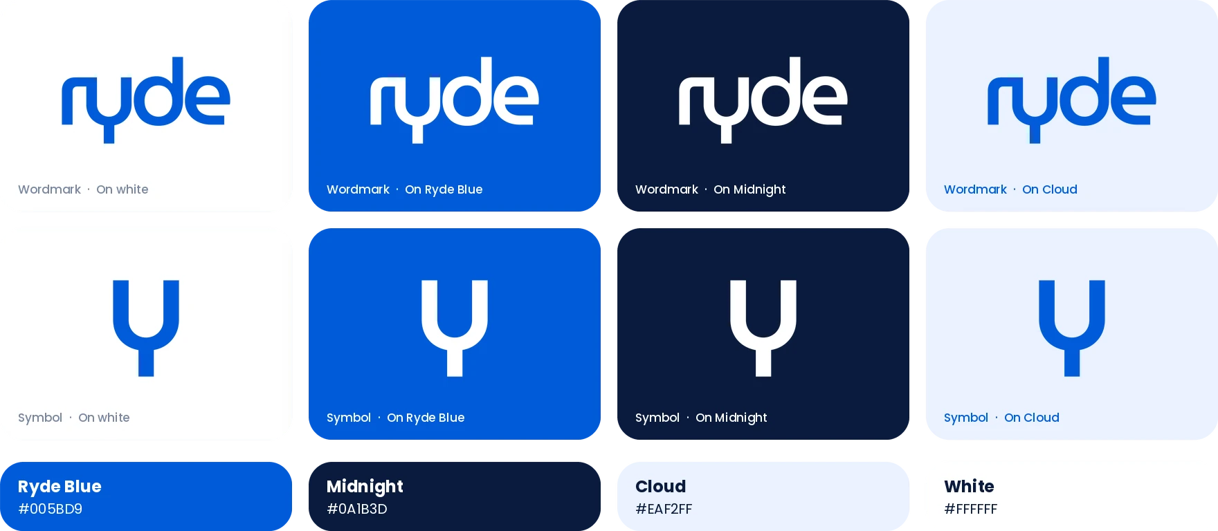
Brand strategy · Brand identity · Logo design · Symbol development · Colour system

The Context
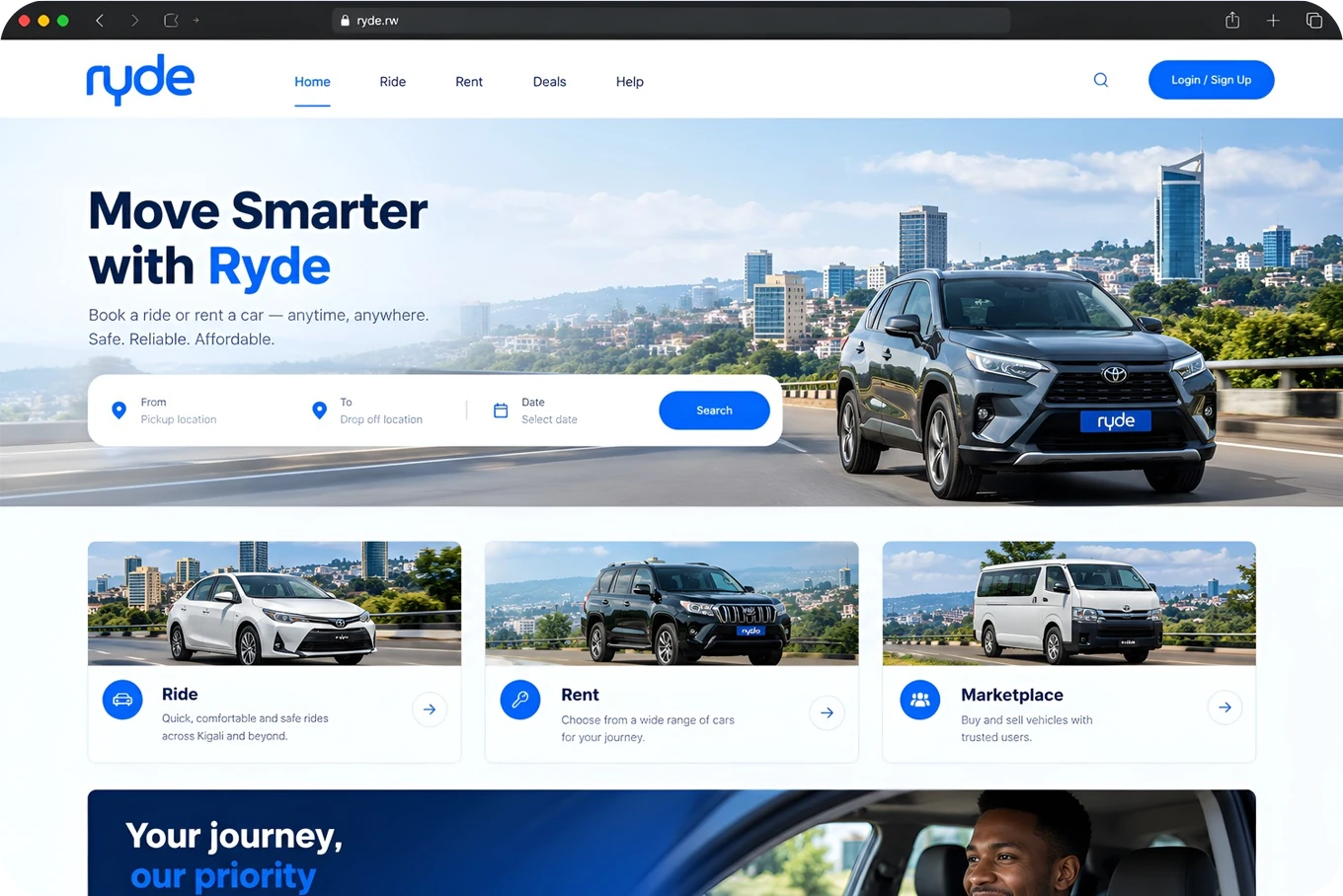
Ryde is a digital-first car marketplace connecting buyers, renters, owners and dealerships. The brand needed to feel modern and technology-driven while staying simple and approachable for a broad automotive audience.
The Solution
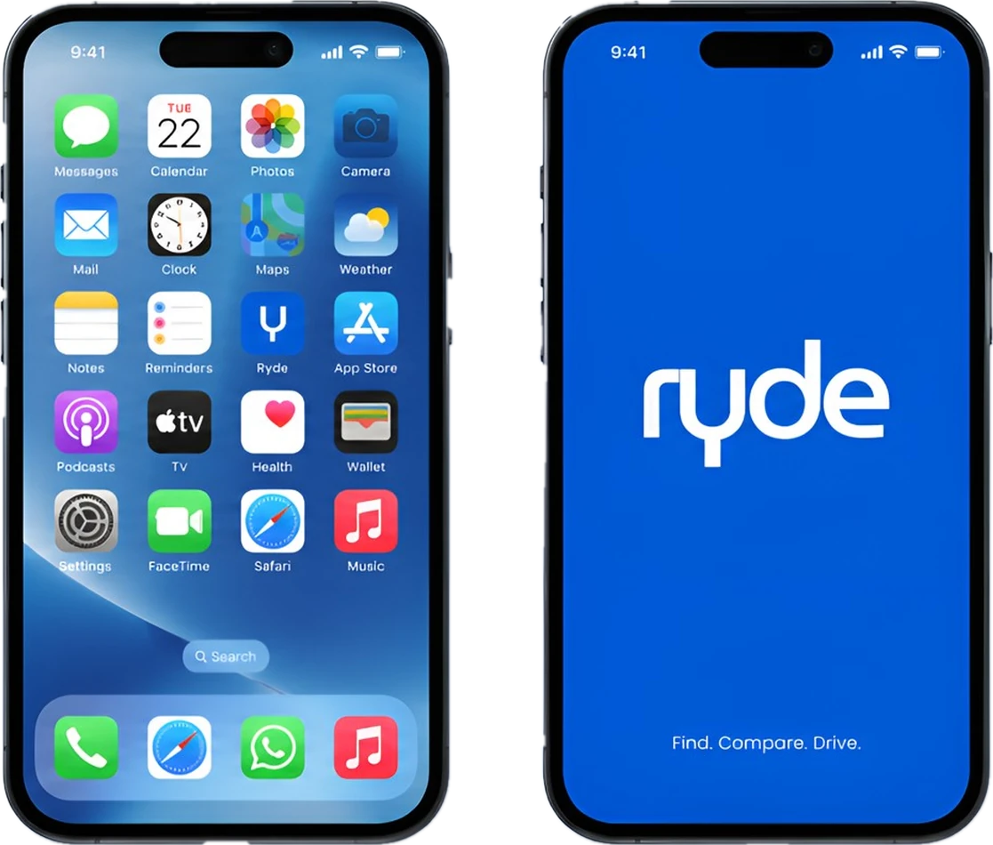
The identity is built on the idea of two paths coming together, buyers and owners meeting through the platform. That idea lives inside the “y” symbol and then extends across the digital and physical brand.


More works
Kari-Beau
Restaurant & Fine Dining · 2025Brand strategy, Brand revamp, Logo refinement
 View case study

AEE Rwanda
Organisation · 2025Brand strategy, Brand revamp, Logo refinement
 View case study

Footprints @ Kinigi
Hospitality & Eco-tourism · 2025Brand strategy, Brand identity, Logo and concept development
 View case study